The house look: How phone brands tune camera color
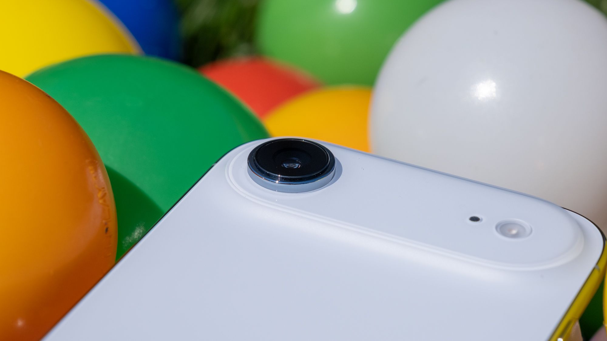
There’s no denying that smartphone manufacturers kind of have a house look. It’s commonly said that Samsung oversaturates, iPhones lean warm, and Pixels crank contrast. We measure color on every phone we test, so we checked to see how close to reality this actually is. Across the phones in this analysis, one cliché is confirmed emphatically, one is confirmed with a twist, and one doesn't survive contact with the data.
Here’s what we found when we looked at the color data.
How we read a "look"
Every phone in the dataset photographs the same 24-patch ColorChecker chart with its main camera under three lighting conditions — bright (1,000 lux at 5500K, simulating daylight), mid (100 lux at 4000K, simulating indoor lighting), and dark (10 lux at 3000K, simulating low light). We use the default auto pipeline for this analysis — the processing buyers actually get, not raw capture. That, after all, is how a phone’s look is applied in the first place.
Two measurements describe a color tuning. The first is saturation, expressed as a percentage of the chart's reference values: 100% means colors match real life, 120% means the phone renders them 20% more intense. The second is blue–yellow bias, a systematic cast measured across all patches. Positive values mean a yellow, warm tint, while negative means blue and cool. Within a couple of points of zero reads as neutral, however past four or five, whites and skin tones visibly shift.
These two axes are independent, and that independence is the point. A phone can be vivid and neutral, restrained and warm, or any other combination. Saturation is a stylistic choice, not necessarily an accuracy failure — a boosted render is a preference, the way a TV's vivid mode is. A color cast is a different phenomenon with a different cause.
The two axes of a brand's look
Vivid or restrained: saturation
In daylight, six of the eight brands push color past reality. Google pushes furthest by a wide margin. Pixel phones average 135% of reference saturation, and the six of them sit in a tight band from 131% to 139%. No other brand's average reaches Google's least saturated phone. The punchy Pixel look is real, deliberate, and applied uniformly across the lineup.
Saturation by brand, daylight
Main camera · 1,000 lux, 5500K · default processing. 100% = colors match real life; higher = more saturated.
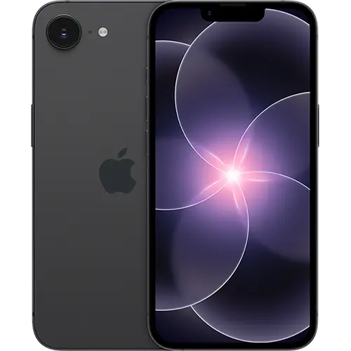
The surprise is who sits second. Apple averages 121%, and five of the six iPhones tested land within a three-point band, from 125% to 128% — the iPhone 17e is the one outlier, at 91%. In good light, the iPhone renders color nearly as intensely as a Pixel.
The middle is crowded: Motorola (117%), Samsung and Honor (115%), and Xiaomi (114%) all boost color moderately. At the restrained end, OnePlus (106%) and Nothing (105%) sit closest to reference.
Which brings us to the myth. Samsung's oversaturation reputation is decades old, and whatever earned it isn't visible in current main-camera tuning. The Galaxy devices are mid-pack and consistent, spanning 112% to 123% — and the most saturated Galaxy in the dataset, the Z Fold 7, renders less intensely than the least saturated Pixel.
Warm or cool: the temperature lean
Daylight is where a phone has the least excuse for a color cast, and most brands show only a mild one — a slight yellow lean of two to five points, common enough across the industry to read as convention rather than character. Apple sits at the warm end of that range and Google just behind it, but the daylight spread between brands is small — a few points of bias is a subtle difference in practice.
Warm vs cool by brand, daylight
Main camera · 1,000 lux, 5500K · default processing. 0 = neutral white balance; right = warmer (yellow), left = cooler (blue).
Two brands separate from the pack in the other direction. Xiaomi is the coolest tuning in the analysis, with every phone between −2.5 and +0.2, and Nothing sits at effectively zero. In daylight, those are the neutral renders.
So does "iPhones lean warm" hold? In daylight, only mildly — the iPhone's lean is comparable to a Galaxy's. The cliché turns out to be true somewhere else entirely.
The signature map
Plot both daylight axes at once and the industry's taste map appears. Google sits alone at the top of the chart, well above everyone on vividness. Apple floats below it, right of center. Samsung, Honor, Motorola, and Xiaomi form a nearly overlapping cluster in the middle — mildly vivid, near neutral — with Xiaomi nudged toward the cool side. Nothing sits almost exactly at the origin, the closest thing in the dataset to a phone that simply reports what it saw. OnePlus is just above it, slightly warm.
The color signature map
Main camera · daylight (1,000 lux, 5500K). Vertical = saturation (100% = neutral); horizontal = white balance (left cooler, right warmer). Every brand boosts saturation in daylight — the real split is warmth.
One glance at this chart says what the two rankings say separately — there are only about four genuinely distinct color philosophies among these eight brands, and half the industry shares one of them.
The brands without a house look
A brand average implies a brand tuning, and for most of these companies that's fair — Google's six phones behave like one phone. Motorola's seven behave like seven.
Motorola's daylight saturation runs from 101% to 145% across its lineup. The Moto G Power (2026), at 145%, is the single most saturated phone in this analysis — punchier than any Pixel — while the Razr Fold (101%) and Razr+ (2026) (103%) render close to reference. Warmth scatters just as widely, from −0.9 to +8.8. There is no Motorola look; there are seven separate tuning decisions that happen to share a logo. Its mid-table brand average is an artifact of extremes canceling out.
OnePlus shows a milder version of the same thing. Its saturation is consistently restrained, but its white balance splits down the middle: the OnePlus 13 and Open are essentially neutral, while the 15 and 15R carry a steady six-to-seven-point yellow bias in every lighting condition — a fixed warm tint, present regardless of ambient light.
The contrast makes the broader point — a consistent signature is a decision. The brands with a tight look chose one and enforced it across their lineup. The brands without one are tuning each phone in isolation.
What about low light?
The mid and dark test conditions use deliberately warm light — 4000K and 3000K, the color of real living rooms and real nights out. That gives a camera two jobs at once: keep resolving color as light disappears, and decide how much of the ambient warmth to correct away. The data separates the two, and it splits these brands into tunings that hold and tunings that break.
The ones that hold
Google's look doesn't just survive indoor light — it intensifies. Pixel saturation rises from 135% in daylight to 141% indoors (the Pixel 9a reaches 155) and still averages 130 in the dark. White balance goes the other way: the daylight yellow lean swings to −1 indoors, meaning the Pixels scrub the room's warmth out entirely and land faintly cool. Agree with the result or not, it's engineered end to end — the same opinionated render in every condition.
Nothing holds in the opposite way, by staying glued to reference. The Phone (3) measures 101%, 96%, and 92% saturation across the three conditions with a bias that never leaves ±0.1 — the most reference-faithful tuning in this analysis, in any light.
Motorola's individual phones each hold their own tuning steadily, whatever it happens to be. Samsung and Honor desaturate moderately as light falls but keep white balance roughly steady. Xiaomi holds its saturation, but its cool cast turns out to be a daylight trait: in warm ambient light its bias drifts to +3, the camera no longer fully correcting the room's color temperature.
The ones that break
Apple is the case study, and two separate things happen to an iPhone in the dark.
The first is where "iPhones lean warm" actually lives. Indoors, every iPhone keeps a large share of the room's warmth: all six measure between 9 and 13 points of yellow bias under 4000K light, averaging 11.7 — nearly triple the next-warmest brand (Honor, at 4.4). This is a white balance behavior. Where a Pixel neutralizes warm ambient light completely, an iPhone preserves most of it. Whether that's a shortcoming or a deliberate choice to keep a scene's mood is a matter of taste — the golden indoor iPhone shot is the direct, measurable result either way.
The second is that iPhone color drains in genuinely low light. Apple's saturation falls from 127% in daylight to 90% in the dark — below reference — with the iPhone 17 Pro and Pro Max dropping to 74, roughly a quarter of the scene's color intensity gone. The warmth stays. So the vivid, slightly warm iPhone of daylight becomes, at night, the most muted render in the dataset, wrapped in an 8-to-12-point yellow cast.
The iPhone look, in other words, is actually three looks: vivid and mildly warm in daylight, golden indoors, muted and warm at night.
If you're choosing by color
For color that matches what you saw, Nothing is the safest brand pick — the Phone (3) in particular is nearly dead-on in every condition — with the OnePlus 13 close behind. For vivid color that looks the same everywhere, any Pixel delivers the most consistent opinionated tuning in the analysis. The iPhone's warm, saturated character is real and appealing in good light, with golden indoor shots and drained low-light color as the package deal. Samsung, Honor, and Xiaomi all land on mild, mostly neutral boosts that few people would pick out of a lineup. And with Motorola, the brand tells you nothing — check the tuning of the specific phone.
The scoreboard on the folk wisdom: Pixels pop — confirmed, and then some. iPhones lean warm — confirmed, but it's an indoor phenomenon, not a daylight one. Samsung oversaturates — not in this data.
FAQ
Which phone brand takes the most color-accurate photos?
Across the phones we tested, Nothing and OnePlus render closest to reference, with the Nothing Phone (3) holding near-neutral color and saturation in every lighting condition. Most other brands boost saturation at least slightly, so "accurate" and "pleasing" aren't the same thing — if you want colors that match what you actually saw, those two are the safest picks.
Do iPhones really make photos look warm?
Yes, but it's mainly an indoor effect rather than a daylight one. In neutral daylight, an iPhone's warm lean is mild and similar to a Galaxy's. Under warm indoor lighting it's a different story: iPhones hold onto far more of that warmth than rivals do — where a Pixel scrubs the room's color out, an iPhone keeps it, which is exactly what produces those golden indoor shots.
Does Samsung oversaturate photos?
Not in our data. Samsung's main-camera saturation sits mid-pack and stays consistent across its lineup, clearly less aggressive than Google's. Whatever earned Samsung its reputation for punchy color, it isn't in this tuning — among the brands we tested, the most saturated photos come from Pixels, not Galaxys.
Which phones have the most vivid, punchy colors?
Google's Pixels, by a clear margin and consistently across the whole lineup — they push color well past reference in every lighting condition. That vivid look is also hue-accurate rather than sloppy: the colors are intensified, not shifted to the wrong values. If you like photos that pop straight out of the camera, that's the tuning to look for.
Why do phone photos change color in low light?
Two separate things happen as light drops. Cameras shoot under warmer indoor and nighttime lighting, and some phones don't fully correct for it, so images pick up a yellow cast — iPhones lean warmest here, Pixels correct the most. On top of that, some phones desaturate as light falls: an iPhone's colors go from vivid in daylight to muted at night, while a Pixel holds its punch throughout.
Related
Sensor size vs dynamic range: Does a bigger sensor capture more?
Megapixels vs sharpness: Does resolution buy sharper photos?
Apple
iPhone 17 Pro

Samsung
Galaxy S26 Ultra
Samsung
Galaxy S26+
Samsung
Galaxy Z Fold 8 Ultra
Samsung
Galaxy Z Fold 8
Samsung
Galaxy S26
Apple
iPhone 17e
Best Phone Displays
Best Android Phones
Best Phones